-
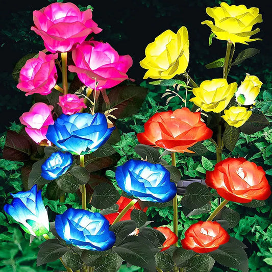
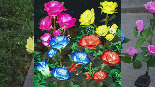
Rose Flower Solar Led Light Outdoor Garden
Regular price $23.40 USDRegular priceUnit price per$32.00 USDSale price $23.40 USDSale -
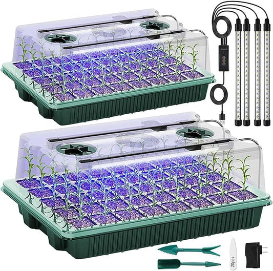
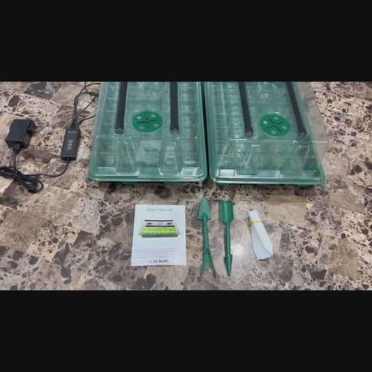
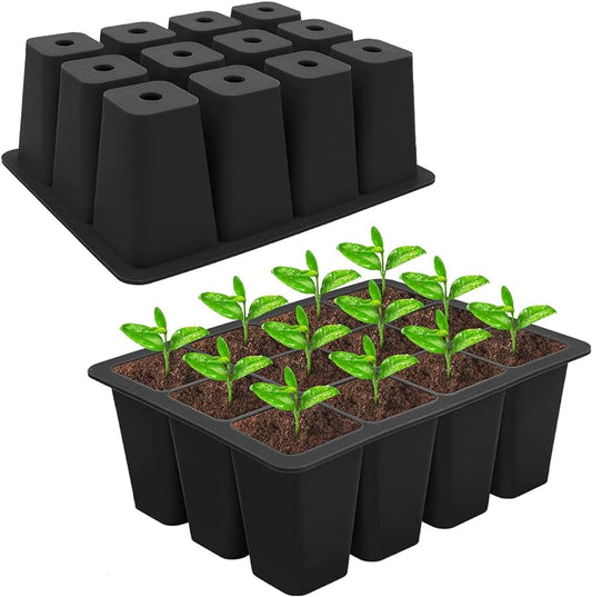
2 Packs - Seed Starter Tray with Grow Light
Regular price $48.49 USDRegular priceUnit price per$72.00 USDSale price $48.49 USDSale -
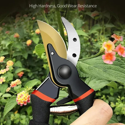
SK5 Blade Pruning Scissors
Regular price $24.89 USDRegular priceUnit price per$38.00 USDSale price $24.89 USDSale -
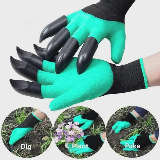
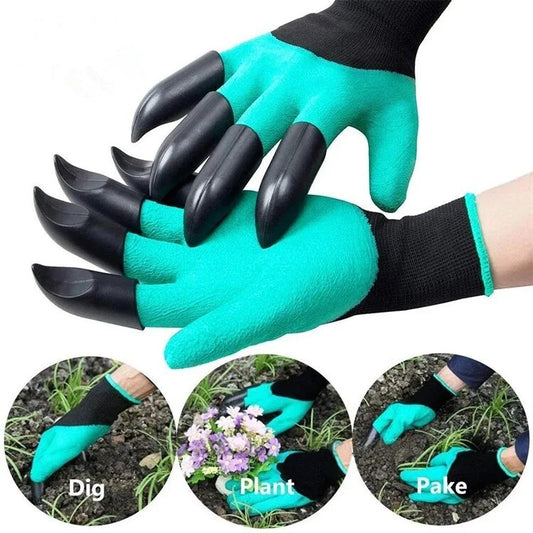
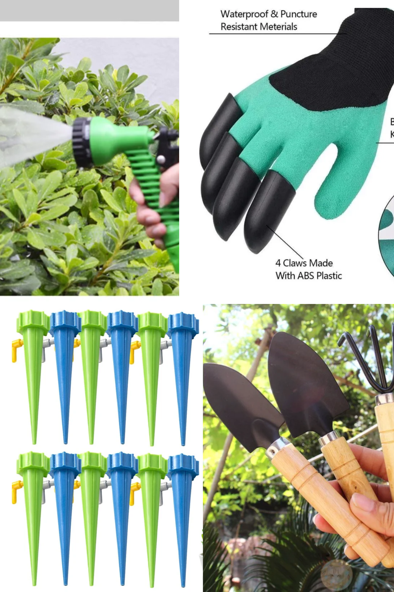
Garden Gloves with Claws Includes 8 ABS Plastic Fingertips Claws for Left and Right Hands
Regular price $15.49 USDRegular priceUnit price per$22.50 USDSale price $15.49 USDSale -
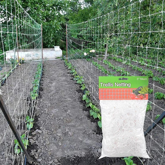
Garden Polyester Plant Trellis Netting Mesh
Regular price From $9.59 USDRegular priceUnit price per$0.00 USDSale price From $9.59 USD -
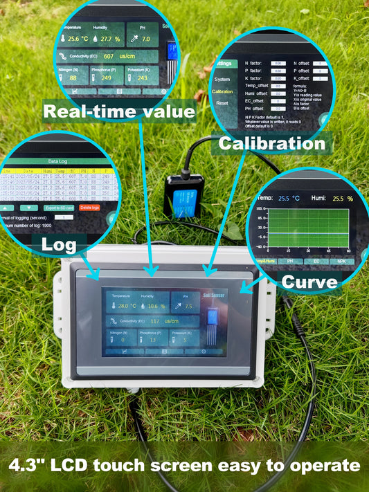
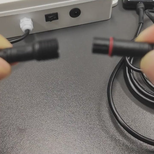
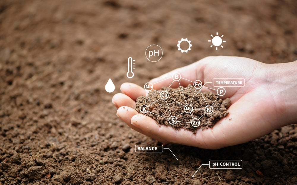
Soil Moisture Temperature Humidity EC PH NPK Sensor 7 in 1
Regular price $232.00 USDRegular priceUnit price per$310.00 USDSale price $232.00 USDSale -
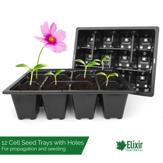
2 Packs-12-Cell PET Plastic Seed Starter Tray
Regular price $21.19 USDRegular priceUnit price per$18.80 USDSale price $21.19 USD -
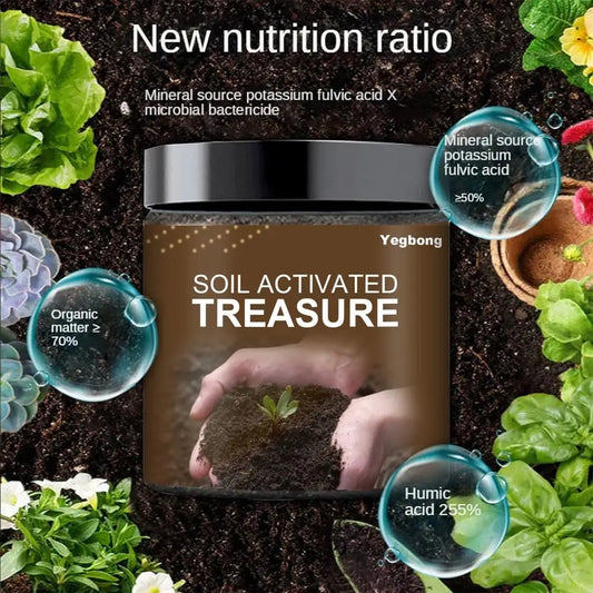
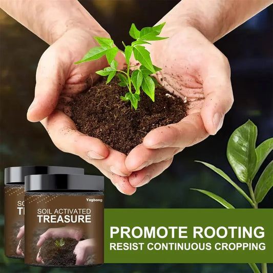
200g Soil Activation Treasure Soil Improvement
Regular price $12.00 USDRegular priceUnit price per$15.00 USDSale price $12.00 USDSale -
Waterproof Wide Brim Hat Summer UV Protection
Regular price $15.00 USDRegular priceUnit price per$25.00 USDSale price $15.00 USDSale -
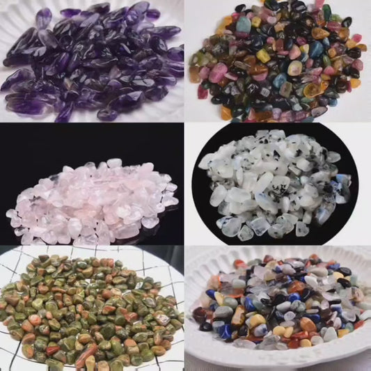
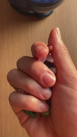
100g Natural Stones Crystals
Regular price $9.00 USDRegular priceUnit price per$14.00 USDSale price $9.00 USDSale -
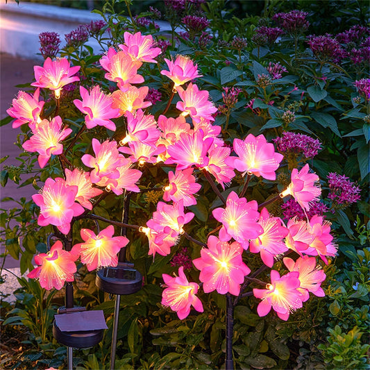
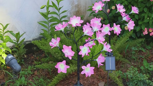
Camellia solar light outdoors waterproof decoration
Regular price $25.50 USDRegular priceUnit price per$35.00 USDSale price $25.50 USDSale -
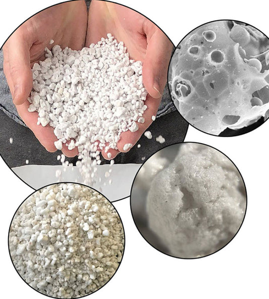
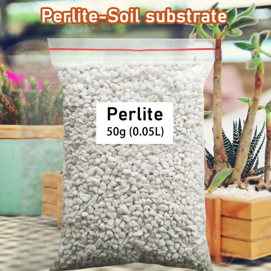
50g (0.5L) Vermiculite Perlite
Regular price $12.49 USDRegular priceUnit price per$18.00 USDSale price $12.49 USDSale -
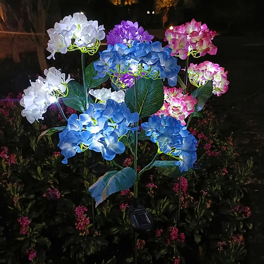
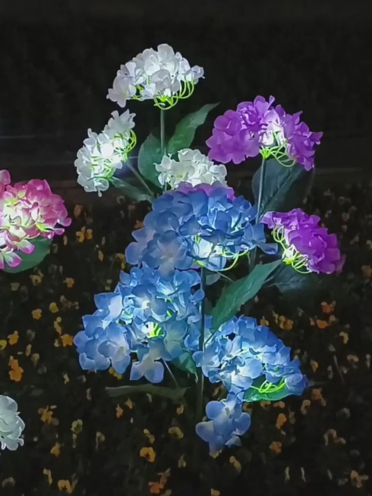
Hydrangea Rose Flower Solar Led Light Outdoor Garden
Regular price $20.99 USDRegular priceUnit price per$32.00 USDSale price $20.99 USDSale -
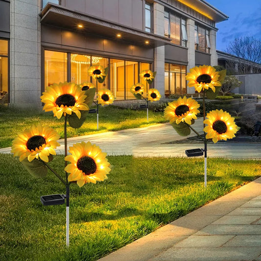
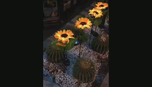
Sunflower Solar Led Light Outdoor Garden
Regular price $20.99 USDRegular priceUnit price per$32.00 USDSale price $20.99 USDSale -
Garden Hose Pipe Water
Regular price $36.08 USDRegular priceUnit price per$72.00 USDSale price $36.08 USDSale -
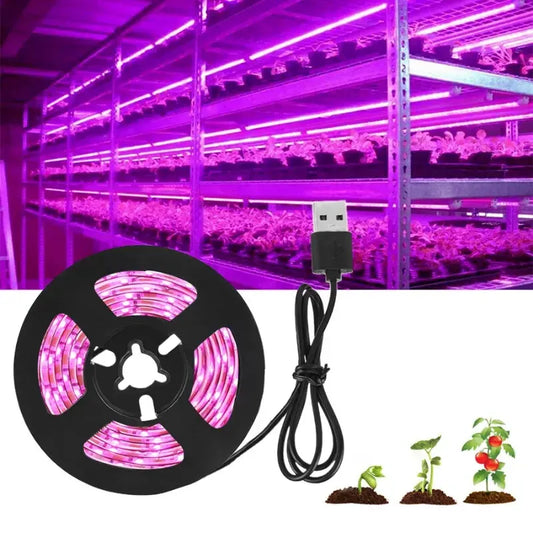
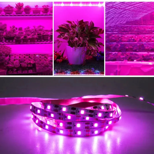
DC 5V USB LED Grow Light Full Spectrum 3 meters
Regular price $23.00 USDRegular priceUnit price per$34.00 USDSale price $23.00 USDSale -
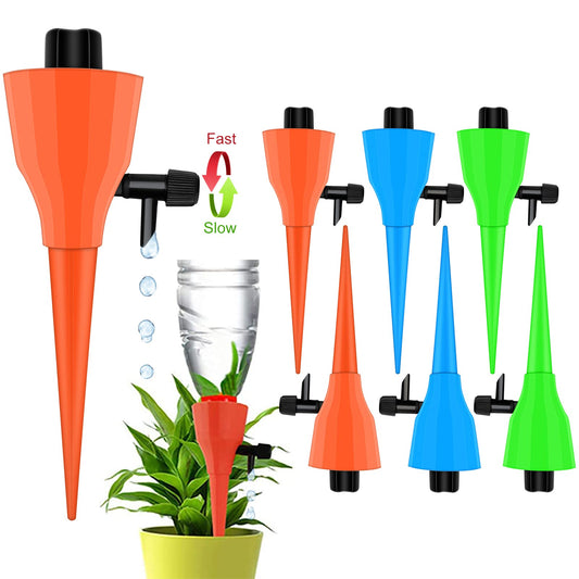
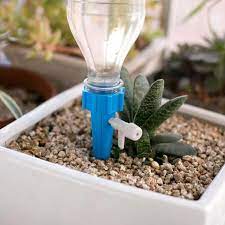
Automatic Drip Irrigation System Self Watering Spike
Regular price $9.50 USDRegular priceUnit price per$15.00 USDSale price $9.50 USDSale -
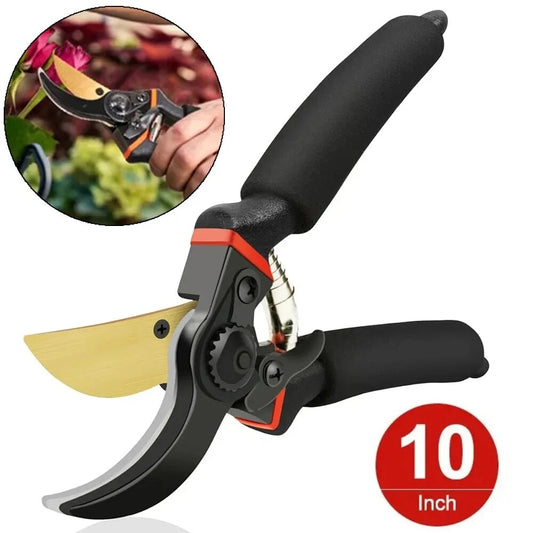
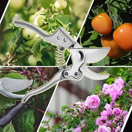
SK5 High Carbon Blades Clippers
Regular price $22.49 USDRegular priceUnit price per$34.00 USDSale price $22.49 USDSale


Collections
-
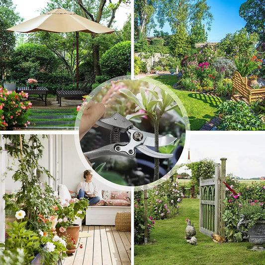
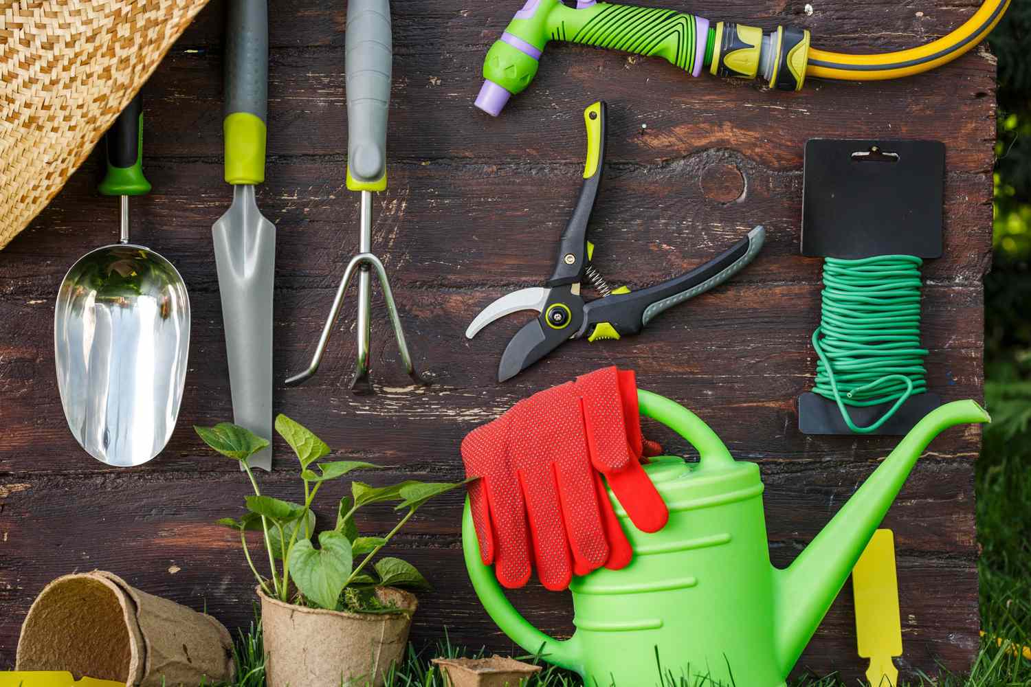
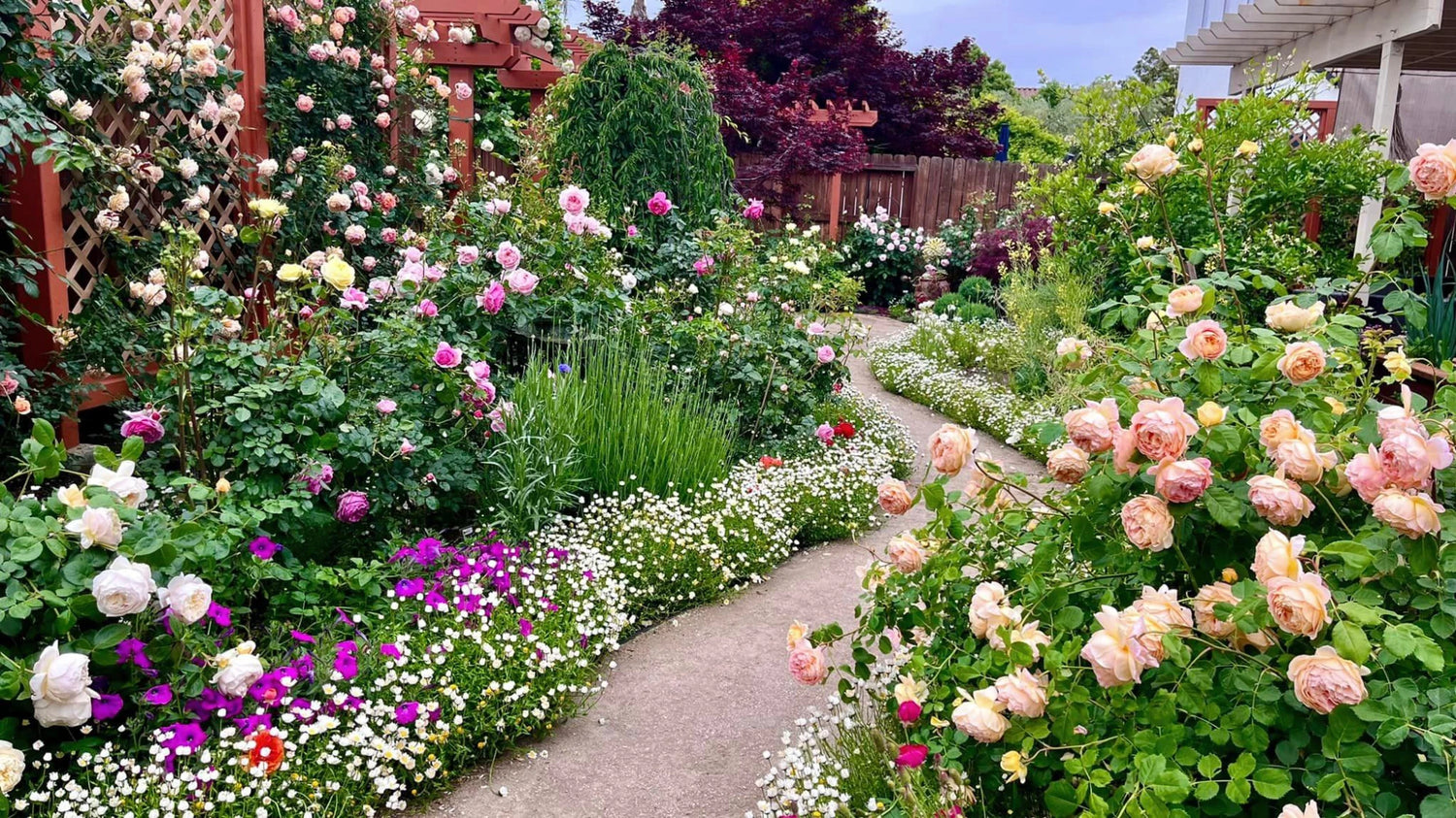
Gardening Equiment And Tools
Make your gardening work is easier and interesting

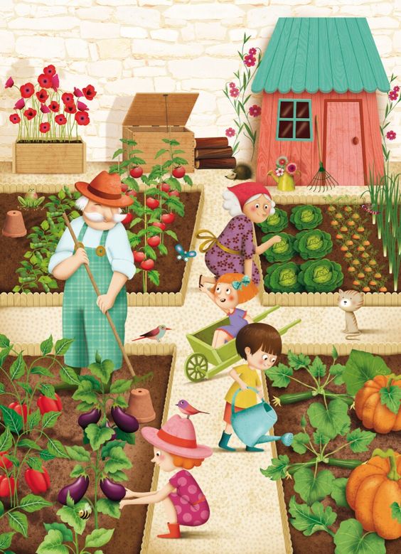
How To Start Gardening?
Starting a garden can be a daunting task, especially if you're a complete beginner. But don't worry, it's also incredibly rewarding! Here are some steps to get you started on your gardening journey.
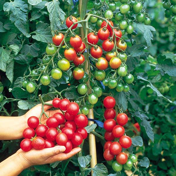
Tomato Planting Guide
Do we really need to introduce the benefits of tomatoes anymore? Let's dive straight into how to grow them from seeds!
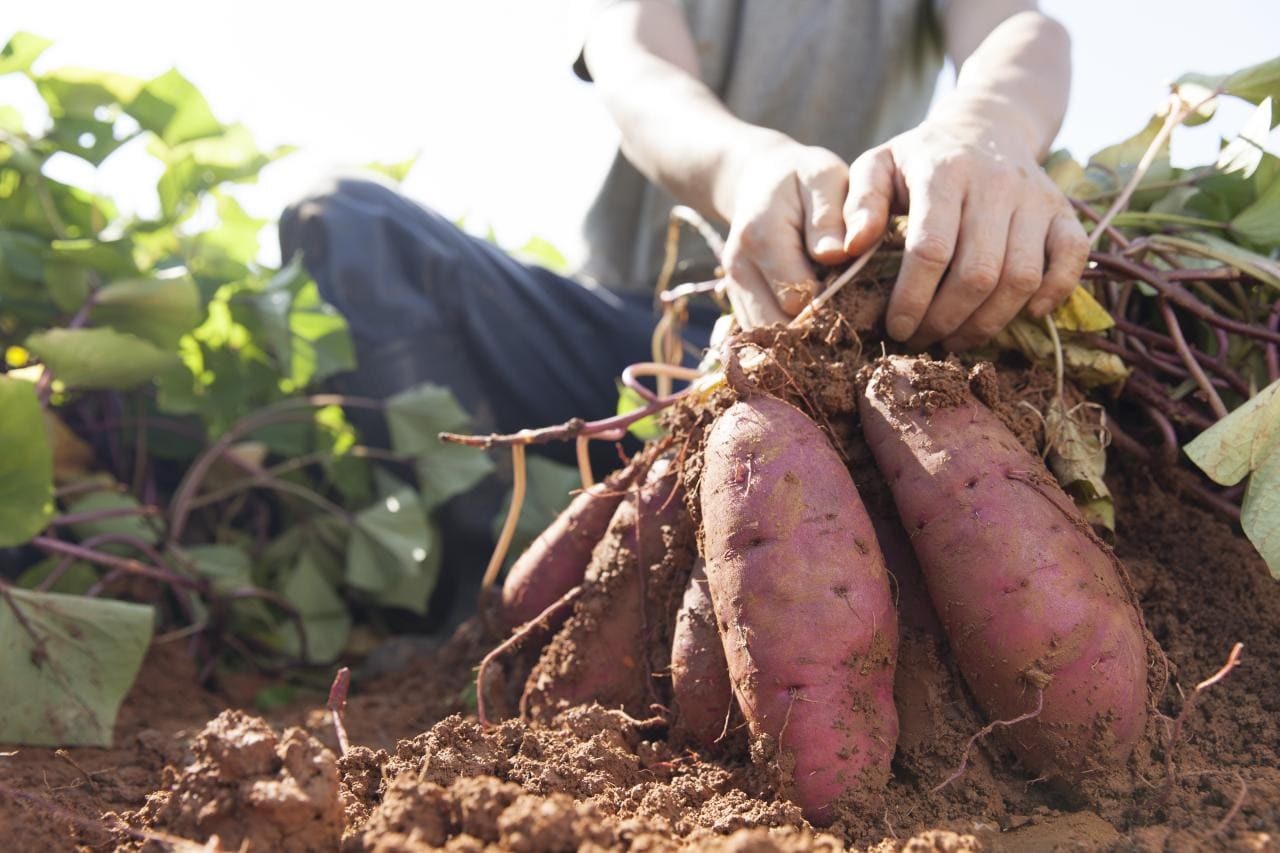
How to grow sweet potatoes?
Certainly, many people enjoy eating sweet potatoes but may not know where to find the right variety of plants. Today, I'll guide you on how to propagate sweet potato vines and how to plant them.

-
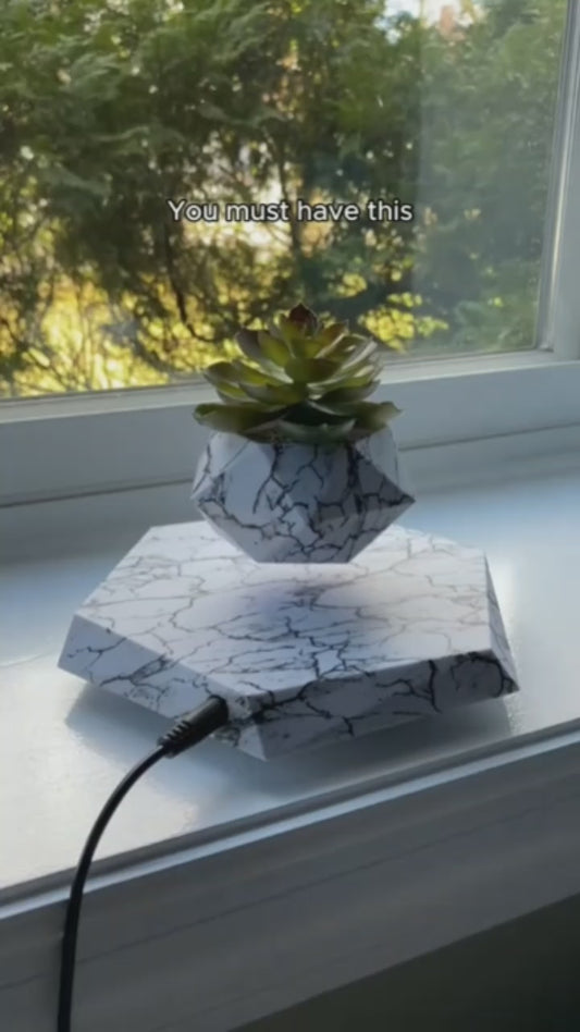
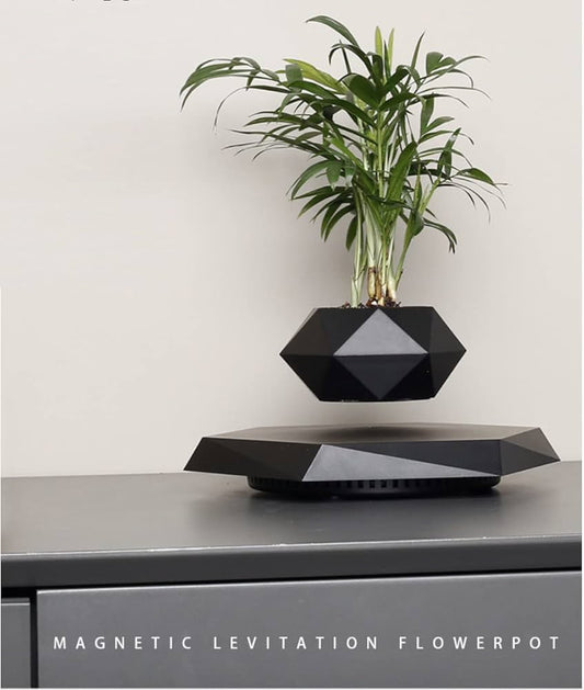
Levitating Air Bonsai Pot Rotation
Regular price From $58.59 USDRegular priceUnit price per$104.99 USDSale price From $58.59 USDSale -
2 Packs-12-Cell PET Plastic Seed Starter Tray
Regular price $21.19 USDRegular priceUnit price per$18.80 USDSale price $21.19 USD -
100g Natural Stones Crystals
Regular price $9.00 USDRegular priceUnit price per$14.00 USDSale price $9.00 USDSale -
2 Packs - Seed Starter Tray with Grow Light
Regular price $48.49 USDRegular priceUnit price per$72.00 USDSale price $48.49 USDSale -
Rose Flower Solar Led Light Outdoor Garden
Regular price $23.40 USDRegular priceUnit price per$32.00 USDSale price $23.40 USDSale -
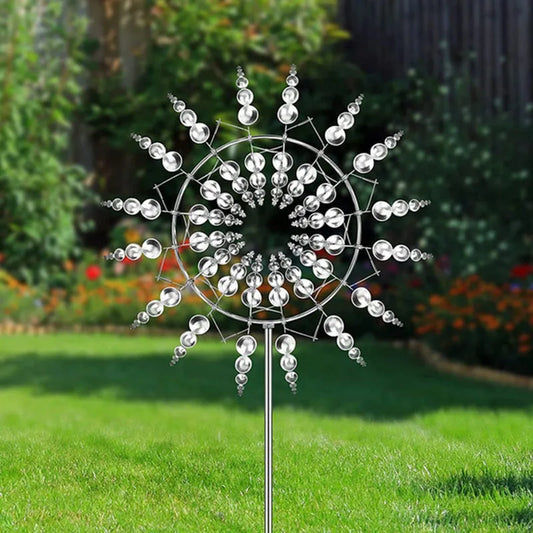
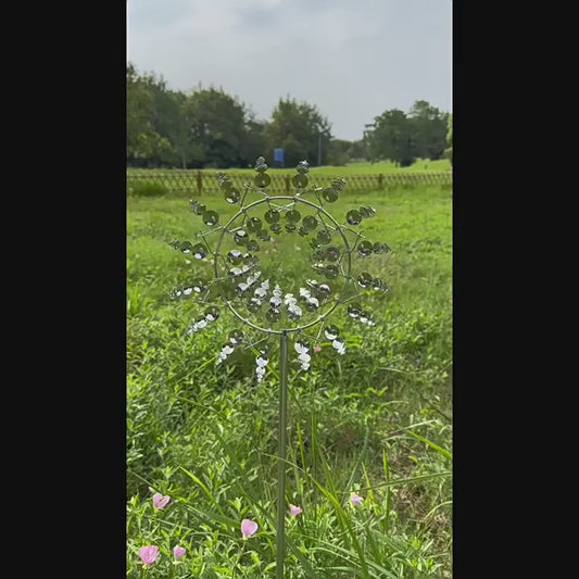
Magical Kinetic Metal Windmill Spinner
Regular price $23.49 USDRegular priceUnit price per$32.50 USDSale price $23.49 USDSale -
Camellia solar light outdoors waterproof decoration
Regular price $25.50 USDRegular priceUnit price per$35.00 USDSale price $25.50 USDSale